Insights
Trend focus - Christmas 2018 cosmetics
Trend focus - Christmas 2018 cosmetics
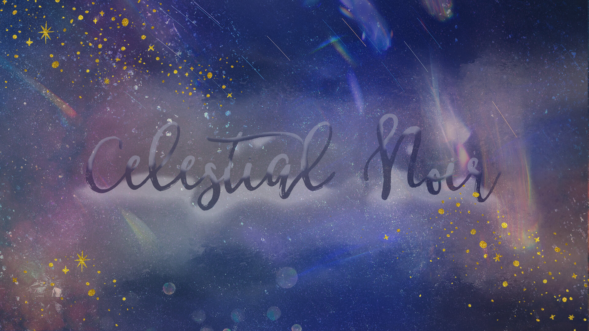
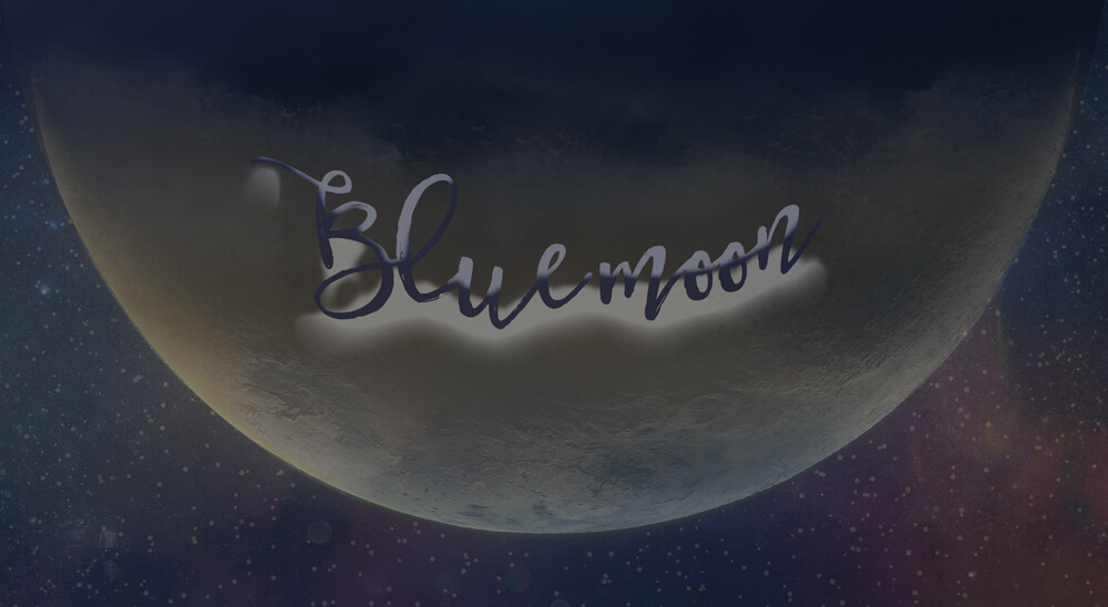
Celestial Noir
2018 kicked off with a super blue moon at the end of January. Moreover, this rare astronomical activity seems to have got us all in the mood for celestial-inspired product and packaging!
Cosmic slogans, product names, illustrations, space imagery, print finishes and materials inspired by the night sky. Emphatically this trend rocks from premium to mass market. Here are the top picks we’re over the moon with. Sorry, we couldn’t resist!
Brand spotlight - Celestial Noir in action
BARE MINERALS
‘Give the Stars’ gift campaign puts the night sky at the forefront of the Bare Minerals Christmas offering. Without a doubt, the well thought out product formats are central to the strength of the offer. Coupled with a retail communications package across digital and print, plus in-store events, this perfectly pitched seasonal story is one of our favourites. With on-point consistency, and a subtle, compelling theme that is really true to brand.
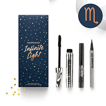
We love...
Centre-stage product placement – this gift packaging enhances the product grouping and performance at every level. Never over-shadowing or detracting from the value of the product itself, or the established packaging style and story.
Enchanting product names – ‘Midnight Moonbeam’ lash duo, ‘Galactic Glow’ and ‘Infinite Light’ eye set, which includes an under eye brightener.
Impactful print finishes – tiny foil stars, combined with navy and white print, creates depth and interest.
Clever font combinations – a fluid, informal hand-written typeface set against clean, fine sans serif lettering. Everything is well considered and specially selected to work with the core branding.
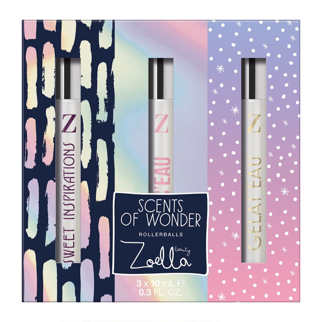
ZOELLA
With separate gifting offerings in Boots and Superdrug for this Christmas, Zoella continues to create a strong retail offer. These ranges build on her beauty vlog success to establish a strong collection of cosmetic and lifestyle products. In essence, this is great ‘go-to’ gifting for Generation Z.
We love...
Playful product names – ‘Big Beauty Bang’ includes ‘Cosmic Crème’ and ‘Star Shower’. Or ‘Lucky Stars’ fragrance quad…we may be over-thinking this, but what’s not to love about a nod to our favourite material girl?
Effective use of pack materials – two colour prints on pearlescent metallic board. Cleverly designed print combinations to create stunning shelf impact.
Consistent product story – inside out, top to bottom, back to front…whichever way you look at it, this product oozes the cosmos. From sparkly shower crème formulations to star-shaped bath melts, shiny metallic components and well-chosen pack formats. Without a doubt, this is a 360 galactic experience!
Other brands sharing this theme:
Hype by Boots
LMX by Little Mix
Real Techniques
Sephora
See our Celestial Noir Pinterest board here for more inspiration >
Graphic Brights
The illustrative trend for playful colours and dramatic, contrasting, bold graphics took shape in 2017. Subsequently, the style has continued this year, making its’ mark in consumer goods.
Show-stopping primaries teamed with sugar pastels, and pure brights make for a bold statement on the shelf. From beer packaging to high-end cosmetics and fine fragrance, this look has been gaining strength at retail throughout the year. Meanwhile, for Christmas, premium brands have utilised the power of colour to full effect.
Here’s what really caught our eye this season...

Brand spotlight - graphic brights in action
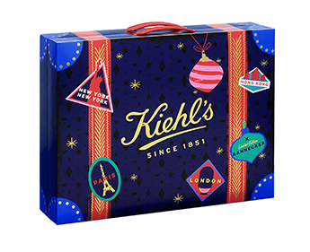
KIEHL'S
Kiehl's have teamed up with artist Andrew Bannecker to create a truly celebratory limited edition holiday collection. Undeniably suited to Kiehl’s signature retro styling with a combination of illustrative detail and repeat prints in bright, solid colours.
We love...
Detail, detail, detail – Delightful ‘reveal’ jar stickers which peel back to leave an illustrated tub top. Soaps ‘dressed up for the Holiday season’ with paired down 50’s wraps. This collection undoubtedly strikes a balance between eclecticism and cohesive styling to pack a punch.
Full ‘Holiday’ immersion – Not content with creating amazing packaging, the clever folks at Kiehl’s have extended the experience online and in-store. Indeed, full window wraps, shelf edges, show cards and concession store displays bring the campaign to life.
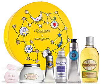
L'OCCITANE
Combining celestial imagery, playful iconography and bold colours in a striking, illustrative style, L’Occitane’s Christmas is irresistibly fresh-faced. The playful appeal oozes personality whilst retaining the premium positioning.
We love...
A limited colour palette used effectively – sticking to primary blue, yellow and red combined with gold, white and black creates standout in store. Furthermore, the colours work surprisingly well with each individual product range.
Thoughtful integration of prints with pack formats – cleverly worked illustrative compositions to each pack format creates an individual feel, without lacking impact over the whole collection.
Other brands sharing this theme:
See our Graphic Brights Pinterest board here for more inspiration >
Naturally Premium
The natural and organic sector has gained in momentum throughout 2018. With big brands and retailers focusing on their ‘clean’ cosmetic and skincare offerings; sustainable and eco-friendly packaging is an integral element.
For natural beauty brands, simplifying packaging materials, processes and waste, while retaining premium positioning and product desirability is key. Specialist stock such as parchment, kraft and textured papers, can add to the sense of occasion. Moreover, these are especially effective when teamed with embossing, single colour prints, varnishes, trims and adornments.
We’ve pulled together a few of our favourites for this season.
Brand spotlight - Naturally Premium in action
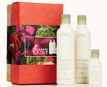
AVEDA
Aveda have a well-established design style that is elegant and understated. Prints, finishes and flashes of colour provide a point of difference between skincare collections. Extending this approach for Christmas, Aveda combine embossed red and green textured papers with white print on kraft paper.
We love...
Making the most of natural packaging materials – embossing decorative designs on textured papers, as well as printing white on kraft card, creates a natural yet luxurious statement.
Removable wraps – these are a great way to communicate the brand and product message at retail. Furthermore, they don’t impact the post-purchase consumer experience. Simply remove, and you have a beautiful stand-alone box. These are especially great for that all important boast factor in the guest en-suite.
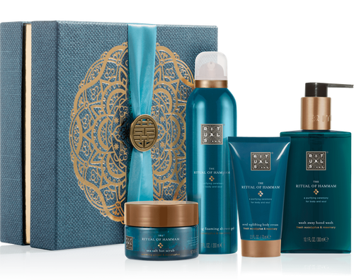
RITUALS
Rituals have the perfect brand position to create a sumptuous, sensory Christmas proposition. Their rigid gift boxes for 2018 do not disappoint. Combining textured material with gold embossed print, ribbon and medallion trim, this is packaging you’ll want to keep.
We love...
Luxurious rigid boxes – beautifully presented with a signature gold embossed emblem on textured fabric with a shiny gold reveal.
Trimmed to perfection – co-ordinated satin ribbon and metallic medallions add to the sense of gift giving theatre ritual (erm, pardon the pun).
Other brands sharing this theme:
See our Naturally Premium Pinterest board here for more inspiration >
Covetable Christmas packaging
Every year we see some divine Christmas packaging structures and formats we wished we’d thought of! Here are a few we’ve spotted this season that we just had to share.
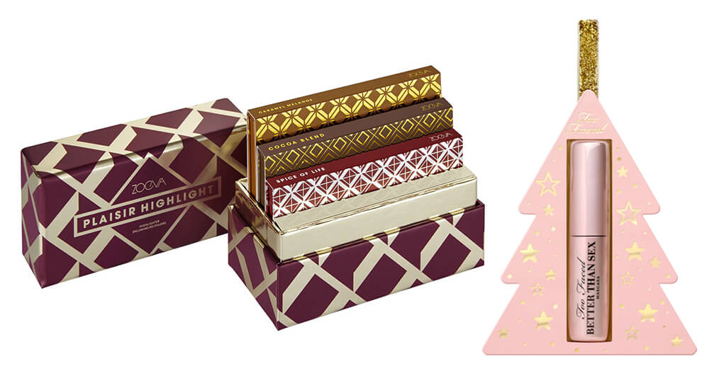
Too Faced Better Than Sex ornament – combine gorgeous covetable packaging without hiding the product.
Zoeva box sets – beautiful palettes in a collectable box format you’ll want to show off.
 |